
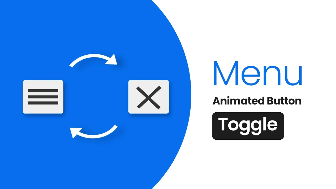
Neumorphism Toggle button in Html & CSS 2020 | CSS Neumorphism Button Effects
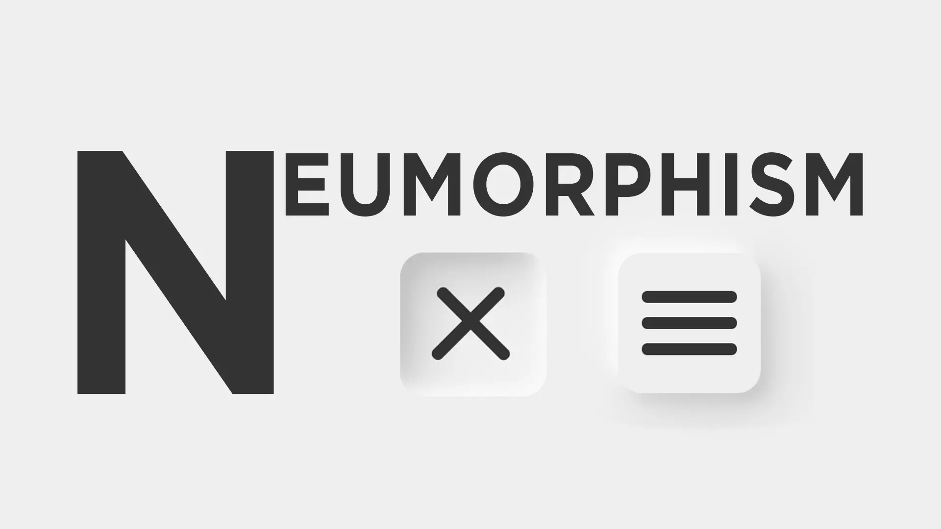
In this CSS tutorial, I will create an awesome Neumorphism Toggle Button in HTML and CSS.
Download Code Files
Neumorphism Toggle button in Html & CSS 2020 | CSS Neumorphism Button Hover Effects |Awesome Buttons
In this CSS tutorial, I will create an awesome Neumorphism Toggle Button in HTML and CSS. This toggle button is created by using Html & CSS and 2 lines of JavaScript for animations | In this video, I will create this cool Neumorphism button design with Html and CSS | Neumorphism Toggle button with hover effects
In this CSS tutorial, I will create an awesome Neumorphism Toggle Button in HTML and CSS. This toggle button is created by using Html & CSS and 2 lines of JavaScript for animations | In this video, I will create this cool Neumorphism button design with Html and CSS | Neumorphism Toggle button with hover effects
HTML
                                <!DOCTYPE html>
<html>

<head>
  <title>Neumorphism Button</title>
</head>

<body>

  <div class="button">
    <input type="checkbox" id="chk">
    <label for="chk" onclick="myfunction(this)">
      <div class="toggle">
        <div class="bar1"></div>
        <div class="bar2"></div>
        <div class="bar3"></div>

      </div>

    </label>

  </div>
</body>
</html>
CSS
                                body {
    background: #eeeeee;
    display: flex;
    align-items: center;
    justify-content: center;
    min-height: 80vh;
  }

  #chk {
    text-align: center;
    visibility: hidden;
    border-radius: 23px;
    z-index: -1;
  }

  #chk:checked {
    transform: skew(30deg);
  }

  .toggle {
    box-shadow: -7px -7px 20px 0px #fff9,
      -4px -4px 5px 0px #fff9,
      7px 7px 20px 0px #0002,
      4px 4px 5px 0px #0001,
      inset 0px 0px 0px 0px #fff9,
      inset 0px 0px 0px 0px #fff1,
      inset 0px 0px 0px 0px #fff9,
      inset 0px 0px 0px 0px #fff1;
    transition: box-shadow 0.6s cubic-bezier(.79, .21, .06, .81);
    padding: 10px;
    cursor: pointer;
    z-index: 1;
    border-radius: 10px;

  }

  .active_button .toggle {
    box-shadow: 0px 0px 0px 0px #fff9,
      0px 0px 0px 0px #fff9,
      0px 0px 0px 0px #fff1,
      0px 0px 0px 0px #fff1,
      inset -7px -7px 20px 0px #fff9,
      inset -4px -4px 5px 0px #fff9,
      inset 7px 7px 20px 0px #0003,
      inset 4px 4px 5px 0px #0001;
  }

  .bar1,
  .bar2,
  .bar3 {
    border-radius: 4px;
    width: 40px;
    height: 5px;
    background-color: #333;
    margin: 6px 0;
    transition: .3s;
  }

  .change .bar1 {
    transform: rotate(-45deg) translate(-9px, 6px);
    transition-delay: .3s;
  }

  .change .bar2 {
    opacity: 0;
    transition-delay: .3s;
  }

  .change .bar3 {
    transform: rotate(45deg) translate(-8px, -8px);
    transition-delay: .3s;
  }
JavaScript Code:
                                function myfunction(x) {
      x.classList.toggle("change");
      x.classList.toggle("active_button");
    }
Conclusion
Recent Post


Most Popular Post


Categories
- HTML & CSS7
- Bootstrap4
- Login Forms8
- Sidebar Menu1
- Card Design1
- CSS Buttons2
- Social Media Buttons1
- Preloader or Loaders5
- Neumorphism Designs3
- Contact Forms5
- Responsive Footers7
- Javascript4
- Websites3
- Bootstrap Cards0
- Vanilla JavaScript1
- jQuery Effects0
- Bootstrap Sidebar Menus0
- CSS Sidebar Menus0
- Navigation Bars3
- Responsive Gallery3
- Responsive Feedback Page2