
How to Create a Button With Loading Spinner in HTML CSS & JavaScript
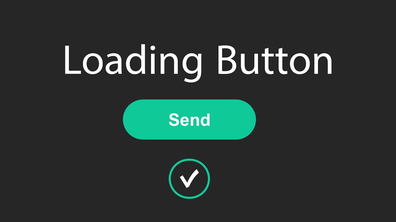
Hey , In this tutorial I will teach you How to Create Button with Loading Animation in Html , CSS and JavaScript
Download Code Files
How to Create a Button With Loading Spinner in HTML CSS & JavaScript | Loading Button on JavaScript
In this tutorial I will teach you How to Create Button with Loading Animation in Html , CSS and JavaScript for Beginners and Professionals. Loading Button Animation using JavaScript. Loading Button | Loader Button | Button with Animation.
Let's Design a Button.
HTML
                                <!DOCTYPE html>
<html>

<head>
  <title>Loading Button Animation</title>
</head>
<body>

  <div class="main">
    <button class="button">Send</button>

    <div class="loader">
      <div class="check">
        <span class="check-one"></span>
        <span class="check-two"></span>
      </div>

    </div>

  </div>
</body>

</html>
Let's Styling a Button.
                                <style>
* {
    margin: 0;
    padding: 0;
  }

  .main {
    background-color: #262626;
    width: 100%;
    height: 100vh;
    display: flex;
    flex-direction: column;
    justify-content: center;
    align-items: center;
  }

  .button {
    position: relative;
    display: block;
    width: 200px;
    height: 45px;
    border-radius: 18px;
    background-color: #10c998;
    border: solid 1px transparent;
    color: #fff;
    font-size: 18px;
    font-weight: 300;
    cursor: pointer;
    transition: all .3s ease-in-out;
  }

  .button:hover,
  .button:focus {
    background-color: transparent;
    border-color: #fff;
    transition: all .3s ease-in-out;
  }

  .loader {
    display: flex;
    justify-content: center;
    align-items: center;
    width: 50px;
    height: 50px;
    background: transparent;
    margin: 30px auto 0 auto;
    border: solid 2px #262626;
    border-top: solid 2px #10c998;
    border-radius: 50%;
    opacity: 0;
  }

  .check {
    width: 100%;
    height: 100%;
    display: flex;
    flex-direction: column;
    justify-content: center;
    align-items: center;
    transform: translate3d(-4px, 50px, 0);
    opacity: 0;
  }

  span:nth-child(1) {
    display: block;
    width: 10px;
    height: 2px;
    background-color: #fff;
    transform: rotate(45deg);
  }

  span:nth-child(2) {
    display: block;
    width: 20px;
    height: 2px;
    background-color: #fff;
    transform: rotate(-45deg) translate3d(14px, -4px, 0);
    transform-origin: 100%;
  }

  /* add class for Javascript */
  .loader.active {
    animation: loading 2s ease-in-out;
    animation-fill-mode: forwards;
  }

  .check.active {
    opacity: 1;
    transform: translate3d(-4px, 4px, 0);
    transition: all .5s cubic-bezier(.49, 1.74, .38, 1.74);
    transition-delay: .2s;
  }

  @keyframes loading {
    30% {
      opacity: 1;
    }

    85% {
      opacity: 1;
      transform: rotate(1090deg);
      border-color: #262626;
    }

    100% {
      opacity: 1;
      transform: rotate(1080deg);
      border-color: #10c998;
    }
  }
</style>
Now Write JavaScript for Loading Animation.
                                <script>


    document.addEventListener('DOMContentLoaded', function () {
      var btn = document.querySelector('.button'),
        loader = document.querySelector('.loader'),
        check = document.querySelector('.check');

      btn.addEventListener('click', function () {
        loader.classList.add('active');
      });
      loader.addEventListener('animationend', function () {
        check.classList.add('active');
      });
    });

  </script>
Recent Post

Most Popular Post
Categories
- HTML & CSS7
- Bootstrap4
- Login Forms8
- Sidebar Menu1
- Card Design1
- CSS Buttons2
- Social Media Buttons1
- Preloader or Loaders5
- Neumorphism Designs3
- Contact Forms5
- Responsive Footers7
- Javascript4
- Websites3
- Bootstrap Cards0
- Vanilla JavaScript1
- jQuery Effects0
- Bootstrap Sidebar Menus0
- CSS Sidebar Menus0
- Navigation Bars3
- Responsive Gallery3
- Responsive Feedback Page2