
Create Neumorphism Social Media Icons in 5 Minutes | HTML & CSS Neumorphic Tutorial
Create Neumorphism Social Media Icons in 5 Minutes | HTML & CSS Neumorphic Tutorial
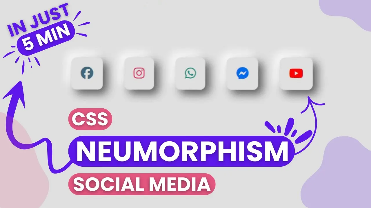
Create Neumorphic Social Media Icons in Just 5 Minutes!
Hello, friends! Explore the trendy neumorphic design technique by learning to craft stylish social media icons in just 5 minutes. In this quick and easy tutorial, you'll learn how to create eye-catching neumorphism-style icons step by step. No problem! If you are beginner or not have any experience. This tutorial is beginner-friendly and will help you master the neumorphism design technique effortlessly.
What You’ll Learn:
- How to apply neumorphism effects for a soft, futuristic look.
- Step-by-step icon design process using simple tools.
- Pro design tips to enhance your skills.
- Create stunning, 3D-style social media icons in minutes.
Whether you're a graphic designer, UI/UX enthusiast, or just starting out, this tutorial will help you improve your design skills instantly!
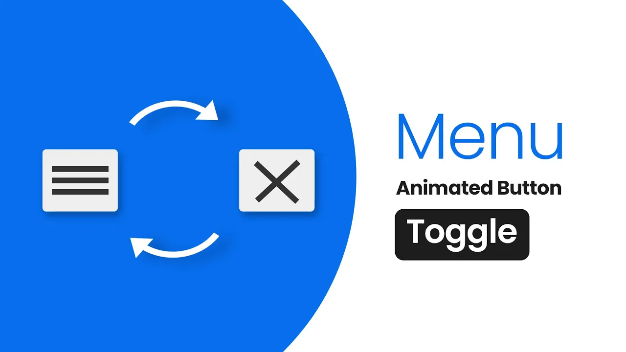
Steps to Create a Neumorphic Toggle Button in HTML and CSS
To create a smooth and modern Neumorphic Toggle Button using only HTML and CSS, follow these simple steps:
- Create a project folder with any name, e.g.,
neumorphic-toggle. Inside this folder, create the necessary files. - Create an
index.htmlfile – This will serve as the main structure of the toggle button. - Create a
style.cssfile – This will contain all the CSS styles for the Neumorphic effect. - Download the Images folder (if needed) and place it inside your project directory. This folder may contain icons or background assets for the toggle button.
Now, add the following HTML code tp your index.htmlfileThis code includes essential HTML markup using <div>, <label>, <input>, and <span> to structure the toggle button.
                                <!DOCTYPE html>
<!-- Source code By theproviders - theproviders.tech -->
<html>
<head>
	<title>Neumorphism Button</title>
		<link rel="stylesheet" type="text/css" href="style.css">
</head>
<body>
<div class="button">
	<input type="checkbox" id="chk">
	<label for="chk" onclick="myfunction(this)">
		<div class="toggle">
			<div class="bar1"></div>
			<div class="bar2"></div>
			<div class="bar3"></div>
		</div>
	</label>
</div>
<script type="text/javascript">
	 function myfunction(x) {
	 	x.classList.toggle("change");
	 	x.classList.toggle("active_button");
	 	// body...
	 }
</script>
</body>
</html>
</div>
In the next step, add the following CSS codes to your style.css file to style your Neumorphic Toggle Button . Experience freely with different CSS properties such as colors, box-shadow, transition, display, justify-content, backgrounds and others properties to make your Neumorphic Toggle Button more attractive.
                                /*Styling for Neumorphism Button*/
body{
  background: #eeeeee;
  display: flex;
  align-items: center;
  justify-content: center;
  min-height: 80vh;
}
#chk{
  text-align: center;
  visibility: hidden;
   border-radius: 23px;
   z-index: -1;
}
#chk:checked{
  transform: skew(30deg);
}
.toggle{
  box-shadow: -7px -7px 20px 0px #fff9,
              -4px -4px 5px 0px #fff9,
              7px 7px 20px 0px #0002,
              4px 4px 5px 0px #0001,
              inset 0px 0px 0px 0px #fff9,
              inset 0px 0px 0px 0px #fff1,
              inset 0px 0px 0px 0px #fff9,
              inset 0px 0px 0px 0px #fff1;
   transition: box-shadow 0.6s cubic-bezier(.79,.21,.06,.81);
   padding: 10px;
   cursor: pointer;
   z-index: 1;
   border-radius: 10px;
}
.active_button .toggle{
  box-shadow: 0px 0px 0px 0px #fff9,
               0px 0px 0px 0px #fff9,
               0px 0px 0px 0px #fff1,
               0px 0px 0px 0px #fff1,
               inset -7px -7px 20px 0px #fff9,
               inset -4px -4px 5px 0px #fff9,
               inset 7px 7px 20px 0px #0003,
               inset 4px 4px 5px 0px #0001;
}
.bar1 , .bar2 , .bar3{
  border-radius: 4px;
  width: 40px;
  height: 5px;
  background-color: #333;
  margin: 6px 0;
  transition: .3s;
}
.change .bar1{
  transform: rotate(-45deg) translate(-9px,6px);
  transition-delay: .3s;
}
.change .bar2{
  opacity: 0;
  transition-delay: .3s;
}
.change .bar3{
  transform: rotate(45deg) translate(-8px,-8px);
  transition-delay: .3s;
}
If you’ve followed the steps correctly, your Neumorphic Toggle Button is ready. Now, open the `index.html` file in your preferred browser and see the smooth Neumorphism effect in action.
Conclusion and Wrapping It Up
Creating a Neumorphic Toggle Button is a fun and practical way to improve your HTML & CSS skills while exploring the modern Neumorphism UI trend. If you followed the steps correctly, you now have a sleek, soft-shadow toggle button that enhances your web design.
Want to take it a step further? Try experimenting with different colors, animations, and transitions to make your toggle even more interactive! You can also explore other Neumorphic UI elements to build a complete theme.
If you run into any issues, don’t worry! You can download the source code for free. Keep experimenting, keep learning! #Neumorphism #WebDesign #Frontend
Recent Post

Most Popular Post
Categories
- HTML & CSS7
- Bootstrap4
- Login Forms8
- Sidebar Menu1
- Card Design1
- CSS Buttons2
- Social Media Buttons1
- Preloader or Loaders5
- Neumorphism Designs3
- Contact Forms5
- Responsive Footers7
- Javascript4
- Websites3
- Bootstrap Cards0
- Vanilla JavaScript1
- jQuery Effects0
- Bootstrap Sidebar Menus0
- CSS Sidebar Menus0
- Navigation Bars3
- Responsive Gallery3
- Responsive Feedback Page2