
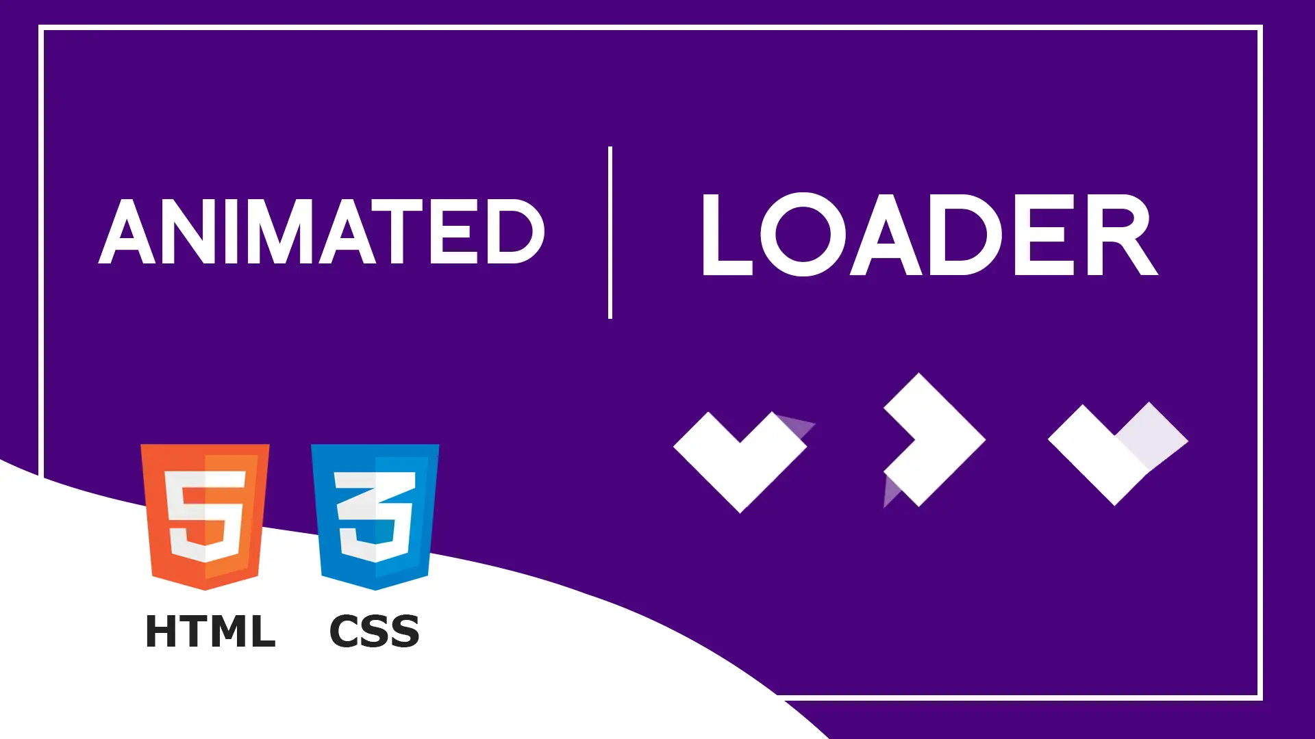
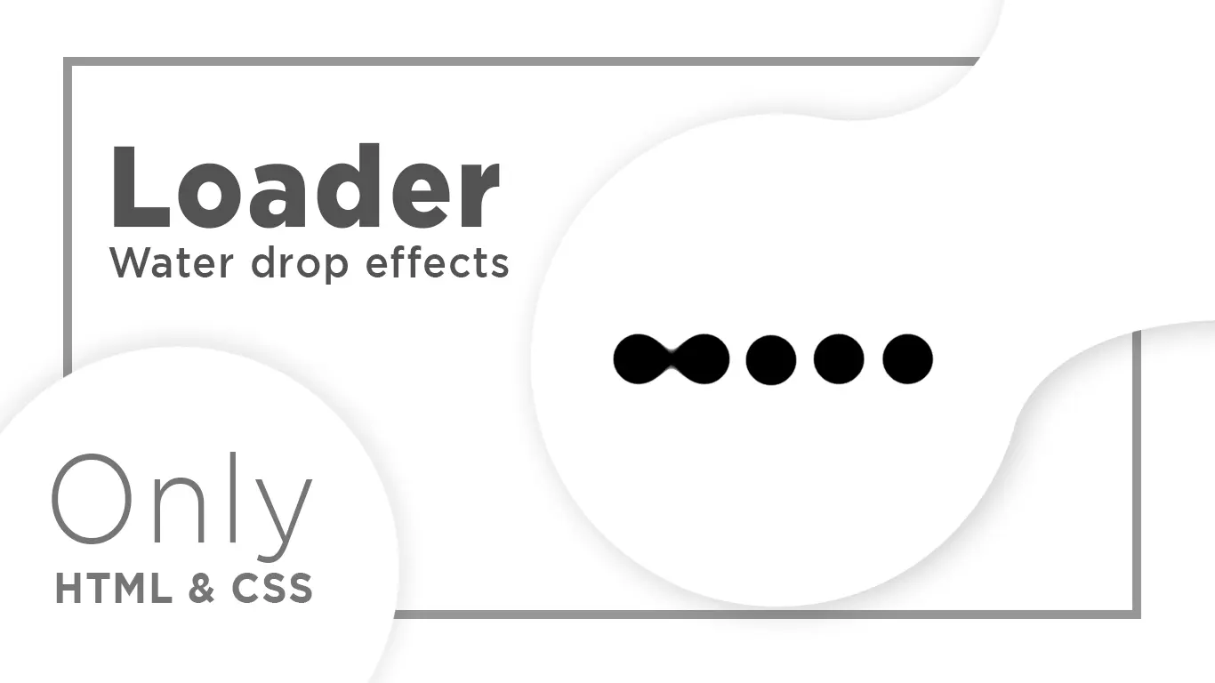
Loader in Html CSS 2021 | Loading Animation in Html and CSS
In this Tutorial You learn How to Create a Loader Using HTML and CSS. How to add Preloader in Website Using HTML and CSS.
Download Code Files
Loader in Html CSS 2021 | Loading Animation in Html and CSS | How to Create Loader in Html & CSS
https://youtu.be/Tl2fV0X76cM
Essentially, preloaders (also known as loaders) are what you see on the screen while the rest of the page’s content is still loading. Preloaders are often simple or complex animations that are used to keep visitors entertained while server operations finish processing. Unfortunately, they are also frequently overlooked in the development process of most projects.
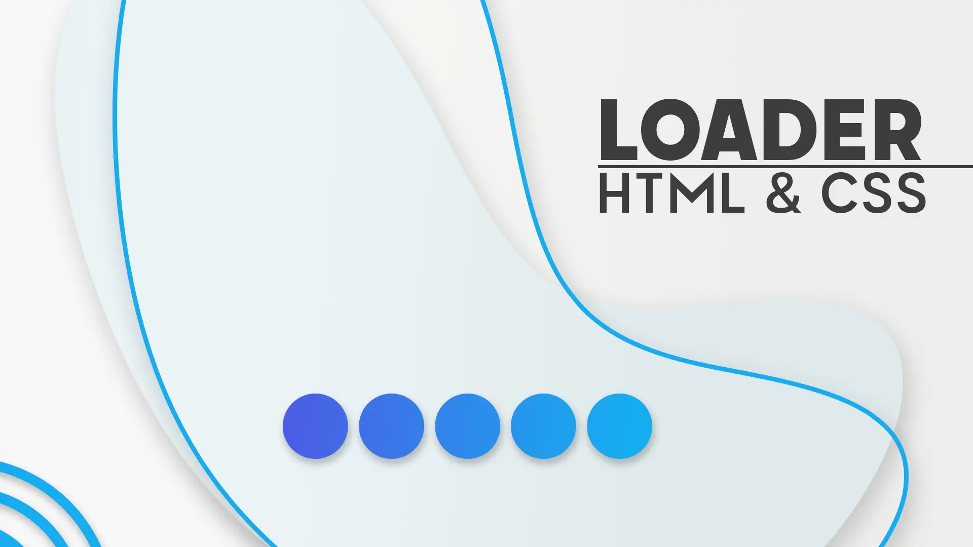
Loader in Html and CSS
HTML
                                <!DOCTYPE html>
<html>

<head>
  <title>Dots Loading in HTML & CSS</title>
</head>
<body>

  <div class="container">
    <div class="item"></div>
    <div class="item"></div>
    <div class="item"></div>
    <div class="item"></div>
    <div class="item"></div>
  </div>
</body>

</html>
CSS
                                body {
    background-color: #dedede;
  }

  .container {
    display: flex;
    justify-content: center;
    align-items: center;
    height: 100vh;
  }

  .item {
    width: 25px;
    height: 25px;
    margin: 10px;
    list-style-type: none;
    transition: 0.5s all ease;
    border-radius: 50%;
  }

  .item:nth-child(1) {
    animation: circle1 1s infinite alternate;
    background-color: #7fd3f5;
    animation-delay: 100ms;
  }

  @keyframes circle1 {
    0% {
      transform: translateY(-60px);
    }

    100% {
      transform: translateY(50px);
    }
  }

  .item:nth-child(2) {
    animation: circle2 1s infinite alternate;
    background-color: #49b8e5;
    animation-delay: 200ms;
  }

  @keyframes circle2 {
    0% {
      transform: translateY(-70px);
    }

    100% {
      transform: translateY(50px);
    }
  }

  .item:nth-child(3) {
    animation: circle3 1s infinite alternate;
    background-color: #3ba2cc;
    animation-delay: 300ms;
  }

  @keyframes circle3 {
    0% {
      transform: translateY(-80px);
    }

    100% {
      transform: translateY(50px);
    }
  }

  .item:nth-child(4) {
    animation: circle4 1s infinite alternate;
    background-color: #2c87d1;
    animation-delay: 400ms;
  }

  @keyframes circle4 {
    0% {
      transform: translateY(-90px);
    }

    100% {
      transform: translateY(50px);
    }
  }

  .item:nth-child(5) {
    animation: circle5 1s infinite alternate;
    background-color: #436eb0;
    animation-delay: 500ms;
  }

  @keyframes circle5 {
    0% {
      transform: translateY(-100px);
    }

    100% {
      transform: translateY(50px);
    }
  }
Conclusion
Recent Post


Most Popular Post


Categories
- HTML & CSS7
- Bootstrap4
- Login Forms8
- Sidebar Menu1
- Card Design1
- CSS Buttons2
- Social Media Buttons1
- Preloader or Loaders5
- Neumorphism Designs3
- Contact Forms5
- Responsive Footers7
- Javascript4
- Websites3
- Bootstrap Cards0
- Vanilla JavaScript1
- jQuery Effects0
- Bootstrap Sidebar Menus0
- CSS Sidebar Menus0
- Navigation Bars3
- Responsive Gallery3
- Responsive Feedback Page2