
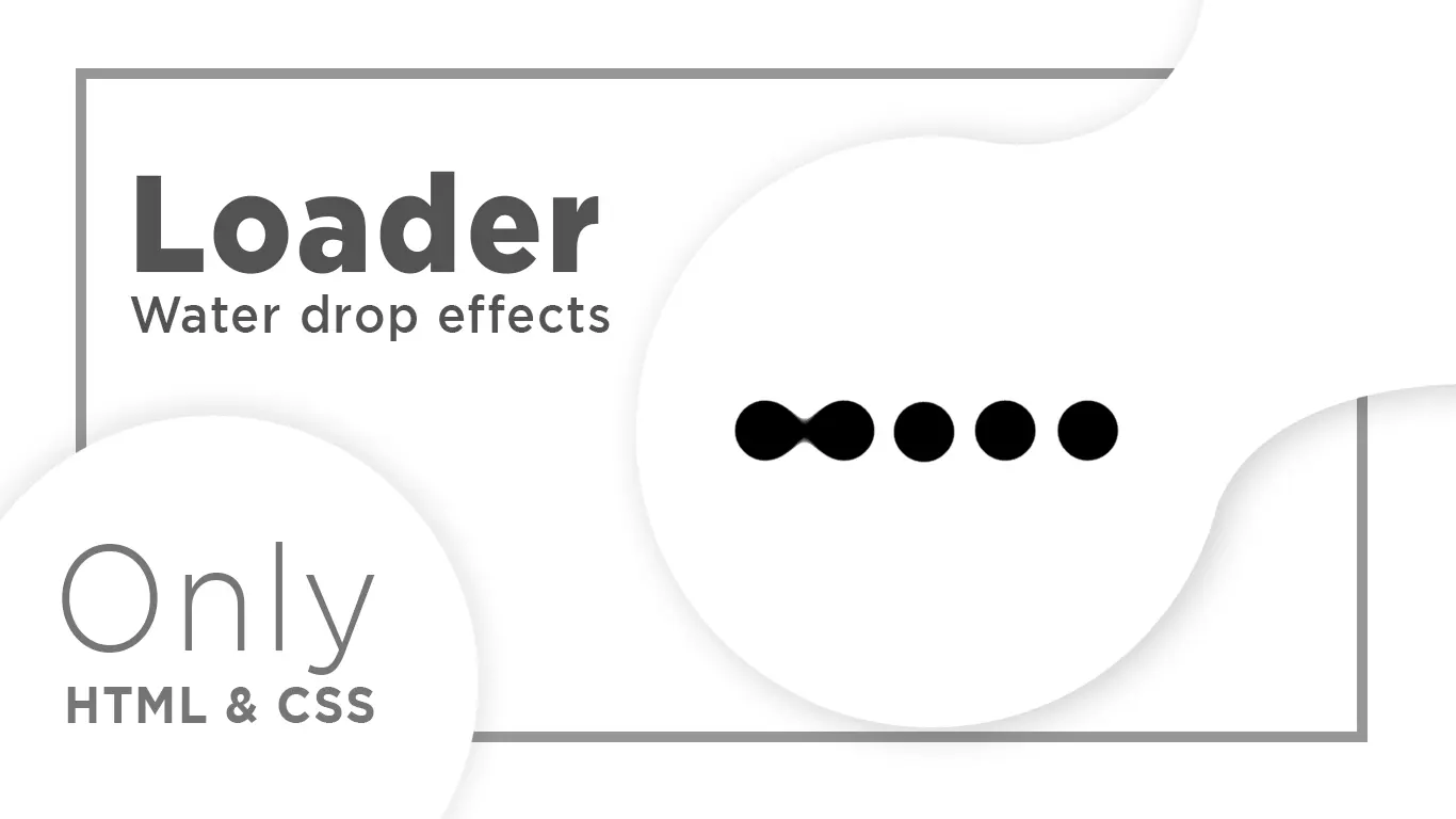
How to Create Awesome Animated Loader | Loading Animation in html and CSS

In this Web design tutorial, We will teach you How to create Animated Loader using only Html and CSS.
Download Code Files
How to Create Awesome Animated Loader | Loading Animation in html and css | Amazing Preloader
https://youtu.be/ocB3i3g6dZM
In this Web design tutorial, We will teach you How to create Animated Loader using only Html and CSS.
This Loading with Awesome Animation. Animated Loader | Awesome animated Loading
Shape Loading in HTML & CSS
HTML
                                <!DOCTYPE html>
<html>

<head>
  <title>Amazing Shape Loading Animation</title>
</head>
<body>
  <div class="loading">
    <div class="circle"></div>
    <div class="circle"></div>
    <div class="circle"></div>
    <div class="circle"></div>
  </div>

</body>

</html>
CSS
                                body {
    background: #2980b9;
  }

  .loading {
    position: absolute;
    top: 50%;
    left: 50%;
    transform: translate(-50%, -50%);
    width: 240px;
    animation-name: loading-rotate;
  }

  @keyframes loading-rotate {

    0%,
    100% {
      transform: translate(-50%, -50%) rotate(0deg);
    }

    50% {
      transform: translate(-50%, -50%) rotate(90deg);
    }
  }

  .loading:before {
    content: "";
    position: absolute;
    width: 120px;
    height: 120px;
    background: #2980b9;
    top: 50%;
    left: 50%;
    z-index: 1;
    transform: translate(-50%, -50%);
    animation-name: loading-rev;
  }

  @keyframes loading-rev {
    0% {
      transform: translate(-50%, -50%) rotate(0deg);
    }

    50% {
      transform: translate(-50%, -50%) rotate(90deg);
    }

    52% {
      visibility: hidden;
    }

    100% {
      transform: translate(-50%, -50%) rotate(0deg);
      visibility: hidden;
    }
  }

  .circle {
    position: relative;
    background: white;
    width: 100px;
    height: 100px;
    border-radius: 100%;
    margin: 10px;
    float: right;
    animation-name: circle-rotate;
  }

  @keyframes circle-rotate {

    0%,
    50% {
      transform: rotate(0deg);
    }

    100% {
      transform: rotate(-360deg);
    }
  }

  .circle:before {
    content: "";
    position: absolute;
    background: #2980b9;
    width: 50px;
    height: 50px;
    animation-name: circle-box;
  }

  @keyframes circle-box {

    0%,
    50% {
      visibility: hidden;
    }

    51%,
    100% {
      visibility: visible;
    }
  }

  .loading,
  .loading:before,
  .circle,
  .circle:before {
    animation-duration: 4s;
    animation-iteration-count: infinite;
    animation-timing-function: cubic-bezier(0.82, 0.01, 0.15, 1.01);
  }

  .circle:nth-child(1)::before {
    left: 0;
    bottom: 0;
    border-bottom-left-radius: 40px;
  }

  .circle:nth-child(2)::before {
    right: 0;
    bottom: 0;
    border-bottom-right-radius: 40px;
  }

  .circle:nth-child(3)::before {
    top: 0;
    left: 0;
    border-top-left-radius: 40px;
  }

  .circle:nth-child(4)::before {
    top: 0;
    right: 0;
    border-top-right-radius: 40px;
  }
Recent Post


Most Popular Post


Categories
- HTML & CSS7
- Bootstrap4
- Login Forms8
- Sidebar Menu1
- Card Design1
- CSS Buttons2
- Social Media Buttons1
- Preloader or Loaders5
- Neumorphism Designs3
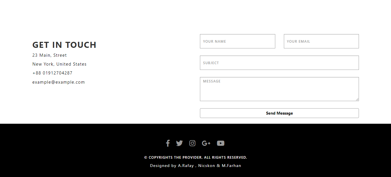
- Contact Forms5
- Responsive Footers7
- Javascript4
- Websites3
- Bootstrap Cards0
- Vanilla JavaScript1
- jQuery Effects0
- Bootstrap Sidebar Menus0
- CSS Sidebar Menus0
- Navigation Bars3
- Responsive Gallery3
- Responsive Feedback Page2