
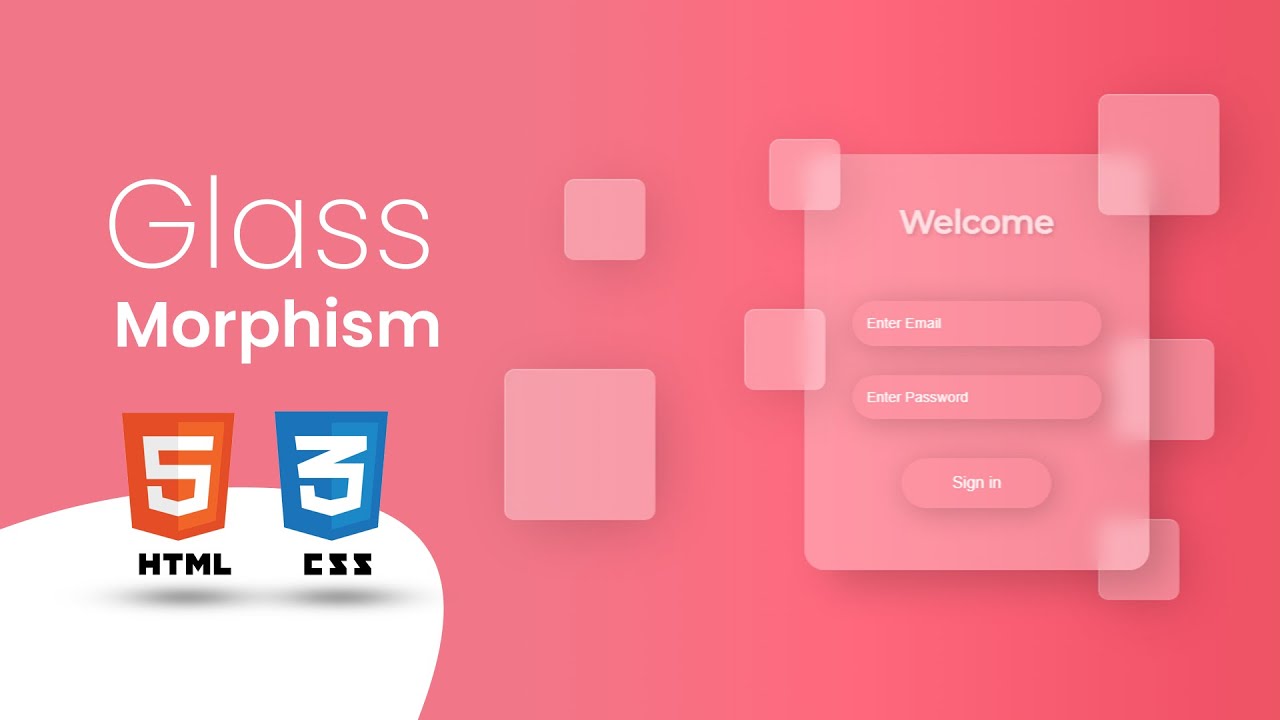
Glassmorphism Login Form using Html & CSS | CSS Animated Login Form
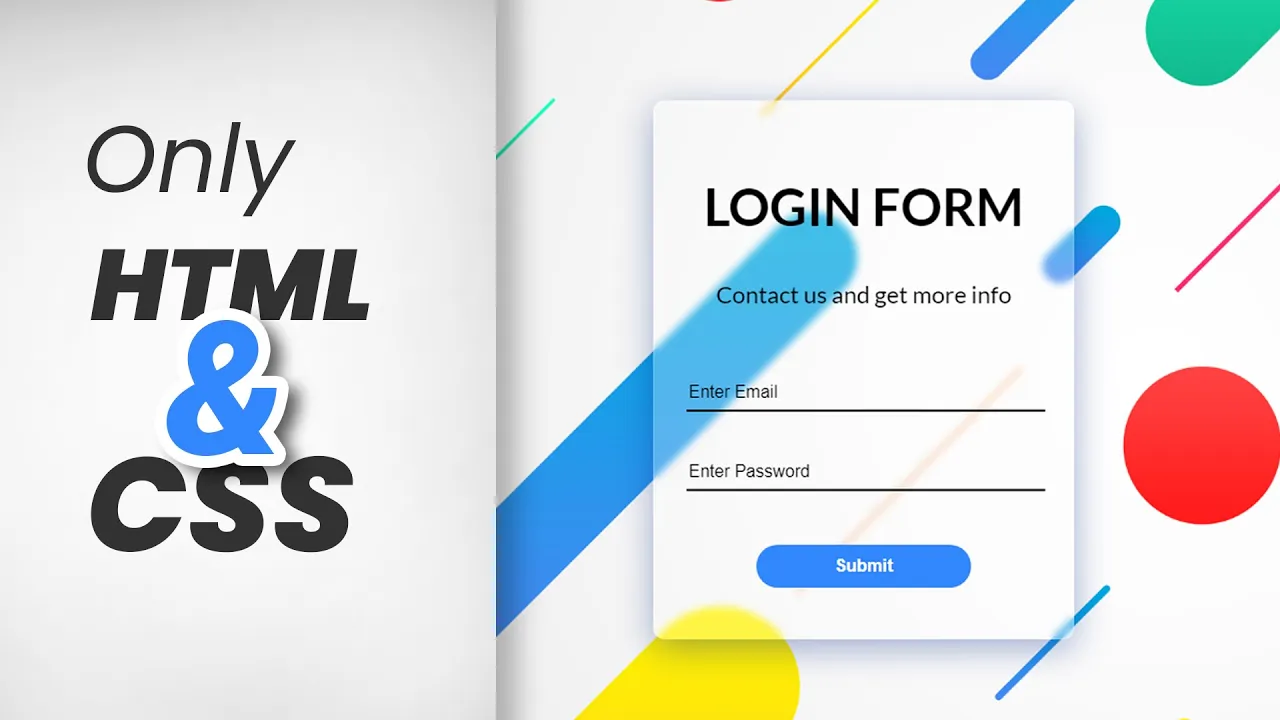
In this Tutorial We will see glassmorphism Login Form in Html and CSS (2022) | Signin Login Page with CSS. Login Form on
Download Code Files
Glassmorphism Login Form using Html & CSS | CSS Animated Login Form | Login Page in Html and CSS
In this Tutorial We will see glassmorphism Login Form in Html and CSS (2022) | Signin Login Page with CSS. Login Form on. How to Implement a Bootstrap 4 Login Form into a Modal Box.How to Build a Functional Login Form with Bootstrap 4.
In this Tutorial We will see glassmorphism Login Form in Html and CSS (2022) | Signin Login Page with CSS. Login Form on. How to Implement a Bootstrap 4 Login Form into a Modal Box
HTML
                                <!DOCTYPE html>
<html>
<head>
	<title>Glassmorphism Login Form</title>
</head>
<body>


   <div class="main">
   	<div class="header">
   		<h2>LOGIN FORM</h2>
   		 <p>Contact us and get more info</p>
   	</div>

      <div class="contactus">
   		<form>
   		<input type="Email" placeholder="Enter Email" required="">
   		<input type="Password" placeholder="Enter Password" required="">
   		<center><button>Submit</button></center>
   	    </form>

   	</div>

   </div>

</body>
</html>
CSS
                                @import url('https://fonts.googleapis.com/css2?family=Lato:wght@300&display=swap');


body{
	background-image: url(https://img.freepik.com/free-vector/hand-painted-watercolor-pastel-sky-background_23-2148902771.jpg?w=2000);
	background-position: center;
	background-size: cover;
	 display: flex;
	 flex-wrap: wrap;
	 min-height: 90vh;
	 justify-content: center;
	 align-content: center;
	 font-family: 'Lato', sans-serif;
}
.main{
	width: 330px;
	height: 400px;
	border: 1px solid #000;
	padding: 30px;
	background: rgba( 255, 255, 255, 0.25 );
	box-shadow: 0 8px 32px 0 rgba( 31, 38, 135, 0.37 );
	backdrop-filter: blur( 3.5px );
	border-radius: 10px;
	border: 1px solid rgba( 255, 255, 255, 0.18 );
}
.header{
	text-align: center;
}
.header h2{
   color: #000;
	font-size: 3rem;
	font-weight: bold;
}
.header p{
	font-size: 22px;
}
input{
	display: block;
	height: 30px;
	width: 100%;
	margin-top: 40px;
	border: none;
	background: transparent;
	border-bottom: 2px solid #000;
	font-size: 16px;
}
input:focus{
  outline: none;
}
input::placeholder{
	color: #000;
	font-size: 16px;
}
button{
	height: 40px;
	width: 200px;
	margin-top: 50px;
	border-radius: 30px;
	cursor: pointer;
	background-color: #3287fc;
	font-weight: bold;
	font-size: 16px;
	color: white;
	border:none;
	transition: all .5s ease-in-out;
}
button:hover{
	background-color: #3287cc;
}
Recent Post

Most Popular Post


Categories
- HTML & CSS7
- Bootstrap4
- Login Forms8
- Sidebar Menu1
- Card Design1
- CSS Buttons2
- Social Media Buttons1
- Preloader or Loaders5
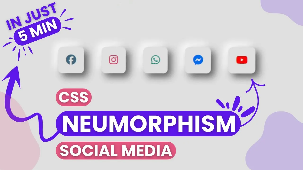
- Neumorphism Designs3
- Contact Forms6
- Responsive Footers7
- Javascript4
- Websites3
- Bootstrap Cards0
- Vanilla JavaScript1
- jQuery Effects0
- Bootstrap Sidebar Menus0
- CSS Sidebar Menus0
- Navigation Bars3
- Responsive Gallery3
- Responsive Feedback Page2