
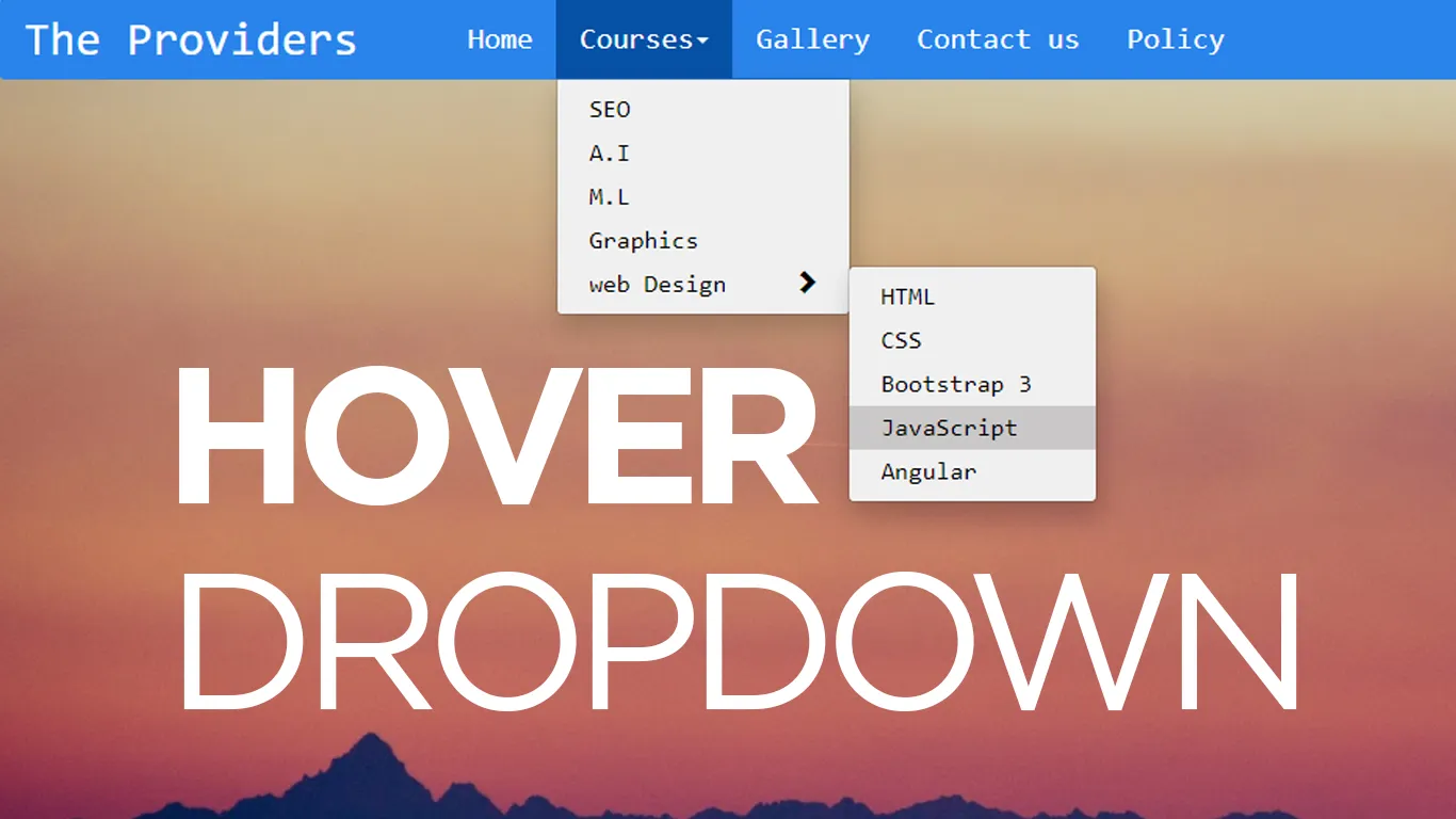
How to Create Animated Navbar in HTML & CSS | Navigation Bar with Hover Effects
In this tutorial, you will learn how to create an Animated Navigation Bar using only HTML & CSS.
Download Code Files
How to Create Animated Navbar in HTML & CSS | Navigation Bar with Hover Effects | Navbar Design
In this tutorial, you will learn how to create an Animated Navigation Bar using only HTML & CSS. We will design a Creative Navbar with stylish hover effects that will make your website look modern and attractive. What you will learn in this video: How to create a Navbar using HTML & CSS only Adding awesome hover effects Designing a responsive navigation bar Creative navbar ideas for websites This Animated Navbar Design is perfect for beginners and front-end developers who want to improve their UI/UX skills.
Let Write a code.
HTML
                                <!DOCTYPE html>
<html>
<head>
	<title>Animated Navbar</title>
	<link href="https://fonts.googleapis.com/css2?family=Poppins&display=swap" rel="stylesheet">
</head>
<body>

    <header>
    	<nav>
    		<div class="logo">
    			<img src="https://yt3.ggpht.com/ytc/AMLnZu819qFaOASCV8YuHNCrH4CGWMUzWVHmQBw_1ngDDA=s900-c-k-c0x00ffffff-no-rj">

    		</div>
    		<ul>
    			<li><a href="#">Home</a></li>
    			<li><a href="#">Services</a></li>
    			<li><a href="#">About</a></li>
    			<li><a href="#">Contact</a></li>
    		</ul>
    	</nav>
    </header>

</body>
</html>
Let's Styling Navbar
                                body{
	margin: 0;
	padding: 0;
	font-family: 'Poppins' , sans-serif;
	background-image: url(https://static.vecteezy.com/system/resources/previews/001/984/880/original/abstract-colorful-geometric-overlapping-background-and-texture-free-vector.jpg);
	background-size: cover;
	background-position: center;
}

header{
	height: 100vh;
}

.logo img{
	position: absolute;
	top: 0;
	left: 0;
	width: 70px;
	height: 70px;
	margin: 10px 20px;
	border-radius: 50%;
	cursor: pointer;
}

.logo img:hover{
	transform: rotateZ(360deg);
	transition: 1s;
}

nav{
	position: absolute;
	top:0;
	width: 100%;
	height: 90px;
	background: rgba(0,9,2,0.1);
}

nav ul{
	float: right;
	margin-right: 150px;
}

nav ul li{
	position: relative;
	display: inline-block;
	padding: 15px;
	overflow: hidden;
}

nav ul li a{
	color: #fff;
	padding: 15px 5px;
	text-decoration: none;
	font-size: 20px;
	transition: .5s;
}

a:after{
	content: '';
	position: absolute;
	padding: 50px;
	right: 5px;
	justify-content: center;
	align-items: center;
	display: flex;
	width: 100%;
	background: #6ea9ff;
	transition: 1s;
	z-index: -1;
	transform: translateY(15px);
}

nav ul li a:hover:after{
	transform: translateY(-50px);
}
Recent Post
Most Popular Post


Categories
- HTML & CSS7
- Bootstrap4
- Login Forms8
- Sidebar Menu1
- Card Design1
- CSS Buttons2
- Social Media Buttons1
- Preloader or Loaders5
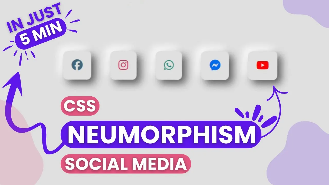
- Neumorphism Designs3
- Contact Forms5
- Responsive Footers7
- Javascript4
- Websites3
- Bootstrap Cards0
- Vanilla JavaScript1
- jQuery Effects0
- Bootstrap Sidebar Menus0
- CSS Sidebar Menus0
- Navigation Bars3
- Responsive Gallery3
- Responsive Feedback Page2