
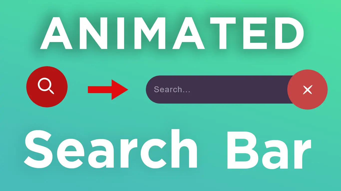
How to Create Animated Sliding Search Bar using HTML & CSS

In this Web Designing Tutorial, you will learn how to create an Animated Sliding Search Bar using only HTML & CSS.
Download Code Files
How to Create Animated Sliding Search Bar using HTML & CSS | Awesome Search Bar Design
We will design a modern and creative search bar with smooth sliding animation that enhances your website’s UI/UX.
Let's Design a Animated Search bar.
Writing a HTML:
                                <!DOCTYPE html>
<html>

<head>
  <title>Animated Search bar</title>
  <link rel="stylesheet" type="text/css"
    href="https://cdnjs.cloudflare.com/ajax/libs/font-awesome/5.14.0/css/all.min.css">
</head>
<body>

  <input type="checkbox" id="chk" hidden="">
  <div class="main">
    <i class="fas fa-align-left"></i>
    <i class="fas fa-grip-horizontal"></i>


  </div>

  <input type="text" placeholder="Search Here...">
  <label for="chk">+</label>

</body>

</html>
Now Write a CSS:
                                * {
    margin: 0;
    padding: 0;
    font-family: Futura, "Trebuchet MS", Arial, sans-serif;
  }

  body {
    background: #eee;
    justify-content: center;
    align-items: center;
    display: flex;
    min-height: 100vh;
  }


  .main {
    width: 227px;
    height: 60px;
    background: #eee;
    align-items: center;
    display: flex;
    border-radius: 50px;
    cursor: pointer;
    transition: .3s all;
    transition-delay: .2s;
    box-shadow: 0px 8px 30px rgba(178, 188, 189);
  }


  i {
    color: #B4B4B4;
    font-size: 2em;
    margin: 10px;
    transition: .3s ease-in-out;
    padding: 10px;
  }

  i:hover {
    color: #7A7675;
  }

  label {
    position: absolute;
    right: 42%;
    width: 50px;
    height: 50px;
    justify-content: center;
    display: flex;
    align-items: center;
    background: #2d5ded;
    color: #fff;
    font-size: 2em;
    border-radius: 50%;
    transition: .4s all;
    cursor: pointer;
    line-height: 2px;
  }

  #chk:checked~label {
    transform: translateX(-335%) rotateZ(404deg);
  }

  input[type=text] {
    position: absolute;
    right: 42%;
    width: 50px;
    height: 50px;
    font-size: 18px;
    color: #eee;
    background: transparent;
    border: none;
    outline: none;
    transition: .4s ease;
    visibility: hidden;
    text-align: center;
  }

  input[type=text]::placeholder {
    color: #eee;
    font-size: 18px;
  }

  #chk:checked~input[type=text] {
    width: 15.5%;
    background: #7491e8;
    border-radius: 40px;
    visibility: visible;
  }

  #chk:checked~.main {
    box-shadow: 0 0 0 50em #2d5ded;
  }
Recent Post


Most Popular Post


Categories
- HTML & CSS7
- Bootstrap4
- Login Forms8
- Sidebar Menu1
- Card Design1
- CSS Buttons2
- Social Media Buttons1
- Preloader or Loaders5
- Neumorphism Designs3
- Contact Forms5
- Responsive Footers7
- Javascript4
- Websites3
- Bootstrap Cards0
- Vanilla JavaScript1
- jQuery Effects0
- Bootstrap Sidebar Menus0
- CSS Sidebar Menus0
- Navigation Bars3
- Responsive Gallery3
- Responsive Feedback Page2