
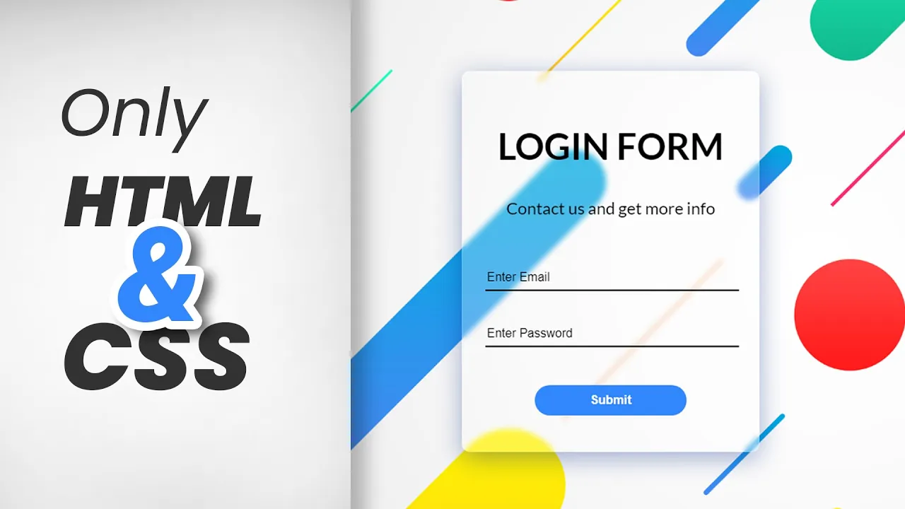
Glassmorphism Login Form using Html & CSS (2021) | Animated Glassmorphism Login Form
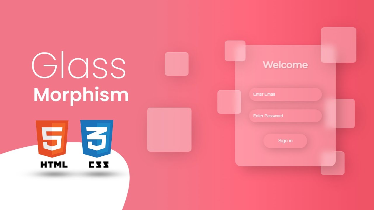
How to Create Glassmorphism Login Form using Html and CSS in 2021. How to Design Glassmorphism Login Form in HTML and CSS.
Download Code Files
Glassmorphism Login Form using Html & CSS (2021) | How to Create Animated Glassmorphism Login Form
In this beginners tutorial, I'll show you how to quickly create and add the Glassmorphism effect to your web design toolbox and add a little bit of coolness to your next project!
In this Glassmorphism CSS Tutorial, I'll show you how to start using this 2021 design trend in website.
HTML
                                <!DOCTYPE html>
<html>

<head>
  <title>Glassmorphism Login Form</title>
  <link href="https://fonts.googleapis.com/css2?family=Montserrat:wght@300;400;500&display=swap" rel="stylesheet">
</head>
<body>

  <div class="container">
    <form>
      <p>Welcome</p>
      <input type="email" placeholder="Enter Email" required=""><br>
      <input type="password" placeholder="Enter Password" required=""><br>
      <input type="submit" value="Sign in" /><br>
    </form>

    <div class="drops">
      <div class="drop drop-1"></div>
      <div class="drop drop-2"></div>
      <div class="drop drop-3"></div>
      <div class="drop drop-4"></div>
      <div class="drop drop-5"></div>
      <div class="drop drop-6"></div>
      <div class="drop drop-7"></div>
      <div class="drop drop-8"></div>
    </div>
  </div>

</body>

</html>
Let Styling login Form CSS
                                body {
    background: linear-gradient(90deg, rgba(241, 119, 136, 1) 18%, rgba(255, 104, 125, 1) 41%, rgba(242, 83, 105, 1) 65%, rgba(224, 87, 87, 1) 87%);
    font-family: 'Montserrat', sans-serif;
    box-sizing: border-box;
  }

  .container {
    position: absolute;
    transform: translate(-50%, -50%);
    top: 50%;
    left: 50%;
  }

  form {
    height: 320px;
    padding: 3em;
    border-radius: 20px;
    background: rgba(255, 255, 255, 0.3);
    backdrop-filter: blur(10px);
    box-shadow: 20px 20px 40px -6px rgba(0, 0, 0, 0.2);
    text-align: center;
  }

  p {
    font-weight: bold;
    color: #fff;
    opacity: 0.7;
    font-size: 2rem;
    margin-top: 0;
    margin-bottom: 60px;
    text-shadow: 2px 2px 4px rgba(0, 0, 0, 0.2);
  }

  input {
    background: transparent;
    width: 220px;
    font-size: 0.9em;
    color: #fff;
    padding: 1em;
    margin-bottom: 2em;
    font-weight: 500;
    border: none;
    border-radius: 50px;
    box-shadow: 4px 4px 30px rgba(0, 0, 0, 0.2);
  }

  input[type="email"]:focus,
  input[type="password"]:focus {
    box-shadow: 2px 2px 40px 5px rgba(0, 0, 0, 0.2);
    outline: none;
  }

  input::placeholder {
    color: #fff;
    font-weight: 400;
  }

  input[type="submit"] {
    margin-top: 10px;
    width: 150px;
    font-size: 1rem;
    cursor: pointer;
  }

  .drop {
    background: rgba(255, 255, 255, 0.3);
    backdrop-filter: blur(10px);
    border-radius: 10px;
    border-left: 1px solid rgba(255, 255, 255, 0.3);
    border-top: 1px solid rgba(255, 255, 255, 0.3);
    box-shadow: 10px 10px 60px -8px rgba(0, 0, 0, 0.2);
    position: absolute;
  }

  .drop-1 {
    height: 70px;
    width: 70px;
    top: -15px;
    left: -35px;
  }

  .drop-2 {
    height: 80px;
    width: 80px;
    bottom: -30px;
    right: -30px;
    z-index: -1;
  }

  .drop-3 {
    height: 100px;
    width: 100px;
    bottom: 130px;
    right: -65px;
    z-index: -1;
  }

  .drop-4 {
    height: 120px;
    width: 120px;
    top: -60px;
    right: -70px;
  }

  .drop-5 {
    height: 80px;
    width: 80px;
    bottom: 310px;
    left: -240px;
    z-index: -1;
  }

  .drop-6 {
    height: 80px;
    width: 80px;
    bottom: 180px;
    left: -60px;
  }

  .drop-7 {
    height: 150px;
    width: 150px;
    bottom: 50px;
    left: -300px;

  }

  .drop-8 {
    height: 130px;
    width: 130px;
    bottom: 200px;
    left: 530px;

  }
Recent Post
Most Popular Post

Categories
- HTML & CSS7
- Bootstrap4
- Login Forms8
- Sidebar Menu1
- Card Design1
- CSS Buttons2
- Social Media Buttons1
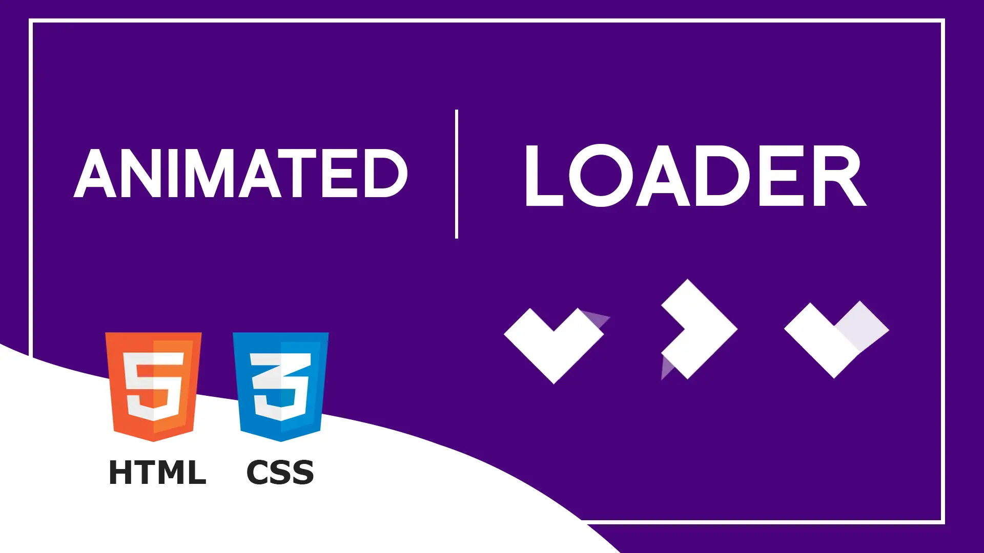
- Preloader or Loaders5
- Neumorphism Designs3
- Contact Forms6
- Responsive Footers7
- Javascript4
- Websites3
- Bootstrap Cards0
- Vanilla JavaScript1
- jQuery Effects0
- Bootstrap Sidebar Menus0
- CSS Sidebar Menus0
- Navigation Bars3
- Responsive Gallery3
- Responsive Feedback Page2