
How to Create Responsive Gradient Footer in bootstrap 5 | Responsive Footer
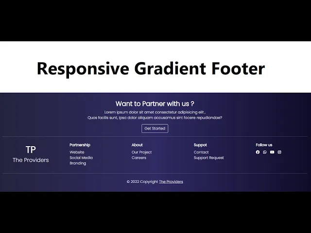
In this Bootstrap 5 Tutorial, I will teach you How to Create a Responsive Gradient Footer using only Html & Bootstrap 5
Download Code Files
How to Create Responsive Gradient Footer in bootstrap 5 | Responsive Footer in Html and Bootstrap 5
In this Bootstrap 5 Tutorial, I will teach you How to Create a Responsive Gradient Footer using only Html & Bootstrap 5. How to Design Responsive Footer in Html & Bootstrap 5. This tutorial is very Useful for all Front end Developers because Bootstrap 5 was recently released.
This tutorial is very Useful for all Front end Developers because Bootstrap 5 was recently released.
HTML with Some Inline CSS
<!DOCTYPE html>
<html>
<head>
<meta charset='utf-8'>
<meta http-equiv='X-UA-Compatible' content='IE=edge'>
<title>Responsive Gradient Footer</title>
<meta name='viewport' content='width=device-width, initial-scale=1'>
<link rel="stylesheet" href="https://cdn.jsdelivr.net/npm/bootstrap@5.1.3/dist/css/bootstrap.min.css">
<link rel="stylesheet" href="https://cdnjs.cloudflare.com/ajax/libs/font-awesome/6.1.1/css/all.min.css">
<link href="https://fonts.googleapis.com/css2?family=Poppins:wght@300&display=swap" rel="stylesheet">
</head>
<body>
<div class="container-fluid text-white p-3" style="font-family: 'Poppins', sans-serif; background: #0f0c29;
background: linear-gradient(to right, #24243e, #302b63, #0f0c29);">
<div class="mt-3 ">
<h3 class="text-center fw-bold">Want to Partner with us?</h3>
<p class="text-center">Lorem ipsum dolor sit amet consectetur adipisicing elit ,<br>
Quos facilis sunt, ipsa dolor aliquam accusamus sint facere repudiandae?</p>
<center><button class="btn btn-block btn-outline-light">Get Started</button></center>
<hr>
</div>
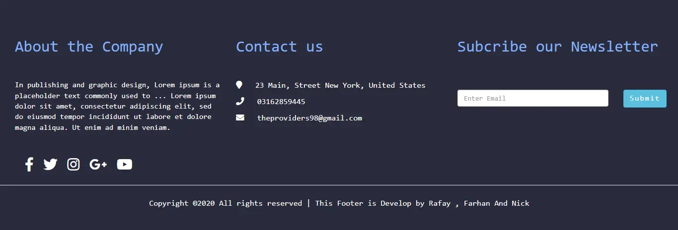
<div class="row justify-content-around text-center text-md-start">
<div class="col-md-2 text-center">
<h1 class="fw-bold mt-3 ">TP</h1>
<h4>The Providers</h4>
</div>
<div class="col-md-2">
<ul class="list-unstyled">
<li class="fw-bold my-2">Partnership</li>
<li> <a href="#" class="text-decoration-none text-white">Website</a> </li>
<li> <a href="#" class="text-decoration-none text-white"> Social Media</a></li>
<li> <a href="#" class="text-decoration-none text-white">Branding</a> </li>
</ul>
</div>
<div class="col-md-2">
<ul class="list-unstyled">
<li class="fw-bold my-2">About</li>
<li> <a href="#" class="text-decoration-none text-white">Our Project</a> </li>
<li> <a href="#" class="text-decoration-none text-white">Careers</a> </li>
</ul>
</div>
<div class="col-md-2">
<ul class="list-unstyled">
<li class="fw-bold my-2">Support</li>
<li> <a href="#" class="text-decoration-none text-white">Contact</a> </li>
<li> <a href="#" class="text-decoration-none text-white">Support Request</a> </li>
</ul>
</div>
<div class="col-md-2">
<li class="fw-bold my-2 list-unstyled">Follow us</li>
<ul class="list-unstyled d-flex justify-content-center justify-content-md-start">
<li><a href="#" class="text-white"><i class="fa-brands fa-facebook me-2 fa-1x"></i></a></li>
<li><a href="#" class="text-white"><i class="fa-brands fa-whatsapp mx-2 fa-1x"></i></a></li>
<li><a href="#" class="text-white"><i class="fa-brands fa-youtube mx-2 fa-1x"></i></a></li>
<li><a href="#" class="text-white"><i class="fa-brands fa-instagram mx-2 fa-1x"></i></a></li>
</ul>
</div>
</div>
<hr>
<div class="row">
<div class="col-md-12 text-center pt-2">
<p>© 2022 Copyright <a href="#" class="text-white">The Providers</a></p>
</div>
</div>
</div>
</body>
</html>
Recent Post
Most Popular Post


Categories
- HTML & CSS7
- Bootstrap4
- Login Forms8
- Sidebar Menu1
- Card Design1
- CSS Buttons2
- Social Media Buttons1
- Preloader or Loaders5
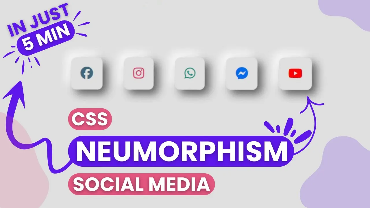
- Neumorphism Designs3
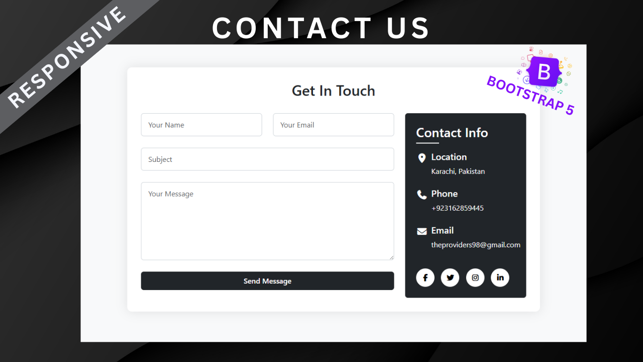
- Contact Forms6
- Responsive Footers7
- Javascript4
- Websites3
- Bootstrap Cards0
- Vanilla JavaScript1
- jQuery Effects0
- Bootstrap Sidebar Menus0
- CSS Sidebar Menus0
- Navigation Bars3
- Responsive Gallery3
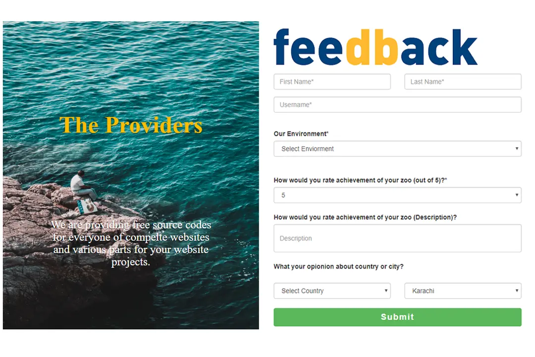
- Responsive Feedback Page2