
Responsive Info Cards with Hover Effect (2021!) | Create Responsive Info Card in CSS
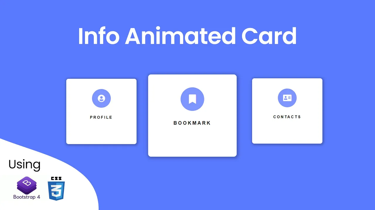
In this Bootstrap tutorial , How to Design Responsive Info Cards with hover effect in Html , CSS and Bootstrap.
Download Code Files
Responsive Info Cards with Hover Effect (2021!) | How to Create Responsive Info Cards Section in CSS
In this tutorial, You will learn How To Use Card In Bootstrap 4 and How To Create Card In Bootstrap 4 and Responsive Cards In Bootstrap 4.
Let's deisgn a Info Responsive Card.
HTML
                                <!DOCTYPE html>
<html>

<head>
   <title>Info Cards with Hover Effects</title>
   <link rel="stylesheet" href="https://maxcdn.bootstrapcdn.com/bootstrap/4.5.2/css/bootstrap.min.css" />
   <link rel="stylesheet" type="text/css"
      href="https://cdnjs.cloudflare.com/ajax/libs/font-awesome/5.15.4/css/all.min.css" />
</head>
<body>
   <div class="content">
      <div class="card">
         <i class="fas fa-user-circle icon fa-2x"></i>
         <p class="title">Profile</p>
         <p class="text">Click to see or edit your profile page.</p>
      </div>

      <div class="card">
         <i class="fas fa-bookmark icon fa-2x"></i>
         <p class="title">Bookmark</p>
         <p class="text">Check all your bookmark is one place.</p>
      </div>

      <div class="card">
         <i class="fas fa-address-card icon fa-2x"></i>
         <p class="title">Contacts</p>
         <p class="text">Add or change your contacts and links.</p>
      </div>
   </div>
</body>

</html>
Let's Write Styling of Card.
                                body {
      background-color: #597aff;
      font-family: helvetica;
   }

   .content {
      width: 100%;
      padding-top: 170px;
      display: flex;
      justify-content: center;
      align-items: center;
      color: #000;
   }

   @media screen and (max-width: 767px) {
      .content {
         padding-top: 80px;
         flex-direction: column;
      }
   }

   .card {
      width: 300px;
      height: 280px;
      background-color: #fff;
      margin: 15px;
      position: relative;
      display: flex;
      justify-content: center;
      border-radius: 10px;
      box-shadow: 2px 2px 10px 5px rgba(0, 0, 0, 0.24);
      cursor: pointer;
      border: 0;
      transition: all 0.3s ease;
      background: linear-gradient(45deg,
            rgba(255, 255, 255, 1) 80%,
            rgba(35, 72, 255, 1) 82%);
      background-size: 450px;
   }

   .icon {
      margin: 0 auto;
      width: 100%;
      height: 80px;
      max-width: 80px;
      background: linear-gradient(90deg,
            rgba(126, 148, 255, 1) 41%,
            rgba(0, 0, 0, 1) 53%);
      border-radius: 100%;
      display: flex;
      justify-content: center;
      align-items: center;
      color: white;
      transition: all 0.8s ease;
      background-size: 200px;
   }

   .card .title {
      margin: 0;
      text-align: center;
      margin-top: 30px;
      font-weight: bold;
      text-transform: uppercase;
      letter-spacing: 4px;
   }

   .card .text {
      width: 80%;
      margin: 0 auto;
      font-size: 13px;
      text-align: center;
      margin-top: 20px;
      letter-spacing: 2px;
      opacity: 0;
      transition: all 0.4s ease-in-out;
   }

   .card:hover {
      height: 300px;
      background-position: -80px;
   }

   .card:hover .info {
      height: 90%;
   }

   .card:hover .text {
      opacity: 1;
      max-height: 40px;
   }

   .card:hover .icon {
      background-position: -100px;
      transition: all 0.4s ease-in-out;
      color: #2348ff;
   }
Recent Post

Most Popular Post
Categories
- HTML & CSS7
- Bootstrap4
- Login Forms8
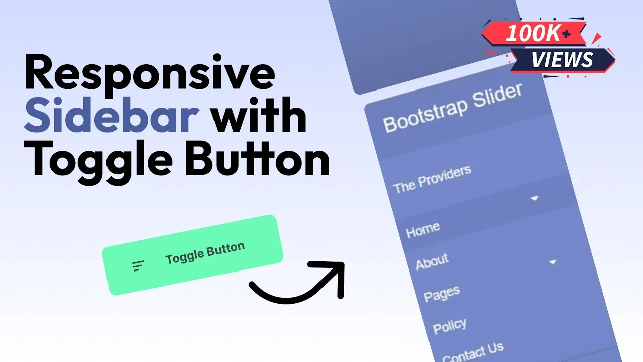
- Sidebar Menu1
- Card Design1
- CSS Buttons2
- Social Media Buttons1
- Preloader or Loaders5
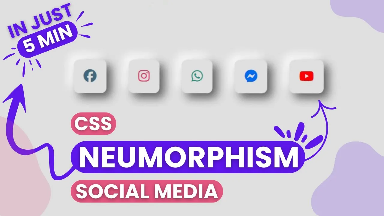
- Neumorphism Designs3
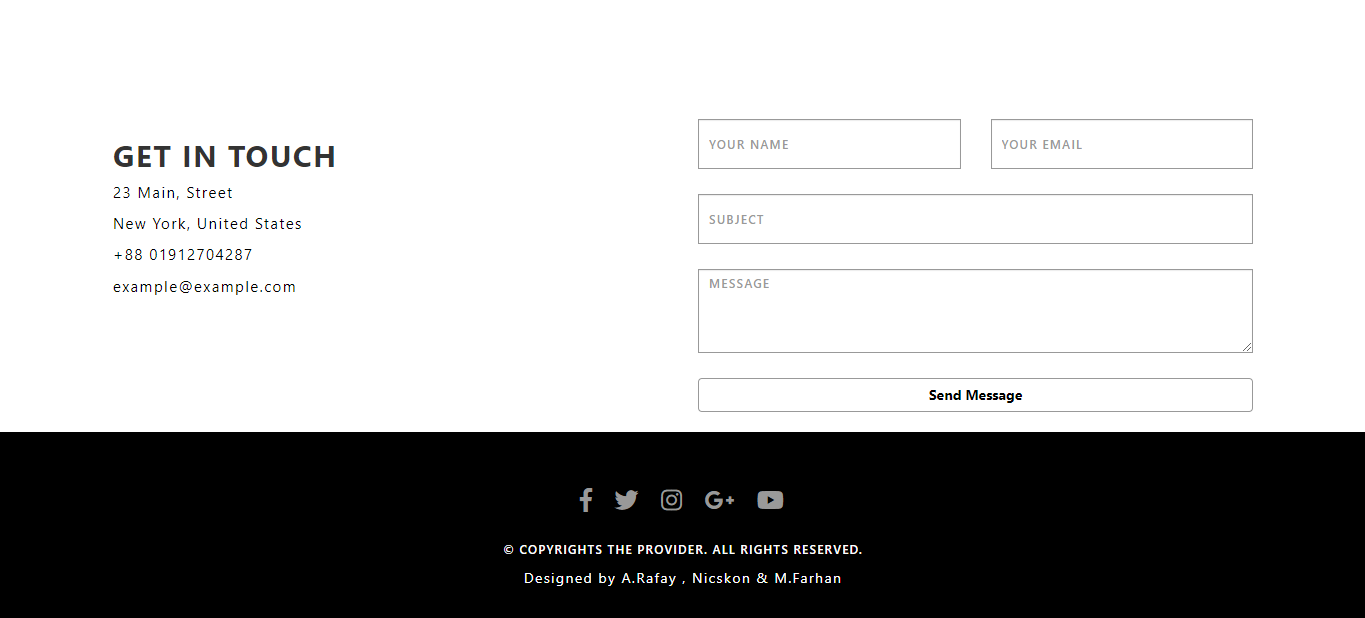
- Contact Forms5
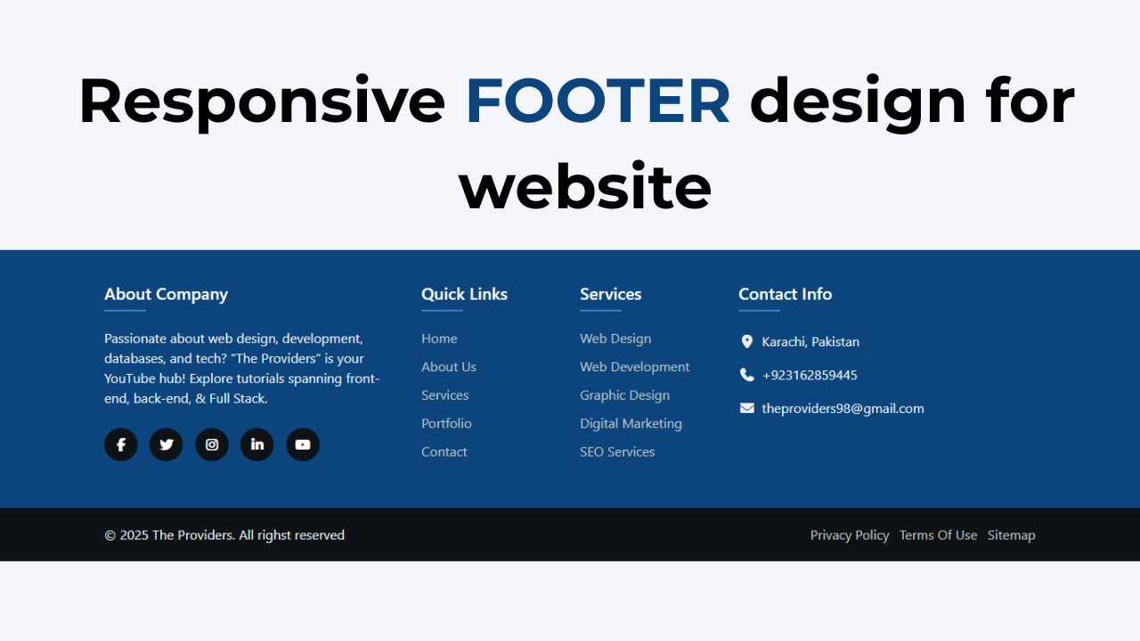
- Responsive Footers7
- Javascript4
- Websites3
- Bootstrap Cards0
- Vanilla JavaScript1
- jQuery Effects0
- Bootstrap Sidebar Menus0
- CSS Sidebar Menus0
- Navigation Bars3
- Responsive Gallery3
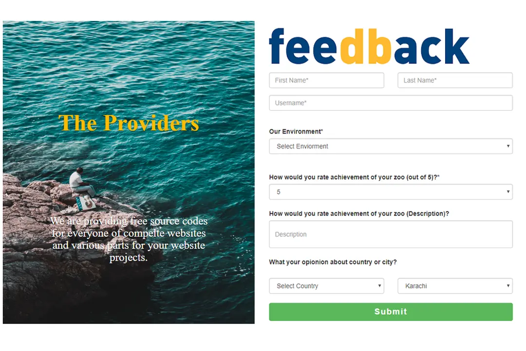
- Responsive Feedback Page2